Does following trends work in stocks?
Whether you trade on the stock, commodity, or forex markets, dealing with the trend strategies requires the same rules of technical analysis. Trends can be found on any chart, so you can try a trend following strategy on any instrument you like.
Who are famous trend traders?
Successful trend traders managed to make billions of dollars with their trend trading skills, tactics, and knowledge of the market structure. We’ve already highlighted George Soros as one of the influencers of a trend trading approach. However, there are more people we can mention.
One of the big names of trend trading is Ed Seykota. He is one of the traders who was interviewed in "Market Wizards" by Jack Schwager. With only $5000 of capital, he managed to make $15 million over 12 years.
Another legend of trend trading is David Harding, the CEO of Winton Capital. His trend following fund for clients exceeds $30 billion in assets.
Finally, you have heard about the hero of the "Reminiscences of a Stock Operator" book Jesse Livermore. Some traders name him the father of the trend following approach. In 1929, he had $100 million. In today’s money, that’s about $1.5 billion. His sense of the market was so impressive that he still inspires traders to this day.
These are some of the most recognized trend following traders, who turned their power and skills into money. Maybe you will be the next one on the list!
How to construct a trend following trading strategy
The first step in building a trend following trading strategy is obvious: you need to determine a trend. You can do this manually, or using indicators.
People with experience in trading can spot a trend in the blink of an eye. The easiest way to do that is to connect highs and lows. You need to connect at least two points on the chart. If the price forms higher highs and higher lows, a trader might suggest that it’s moving within an uptrend. Vice versa, if the price forms lower lows and lower highs – you are facing downward pressure, which will likely start a downtrend.
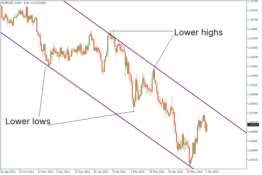
In the picture above, we can identify a clear downtrend after connecting the most obvious peaks and lows of EURUSD on the daily chart. The price forms lower lows and lower highs. Moreover, the price has been moving within a so-called descending channel. That is, balancing between two diagonal lines that limited the price from both upside and downside without a breakout. The price has been moving within this channel for almost nine months. Thus, the downtrend is considered strong.
Trend trading with moving averages
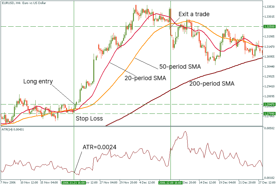
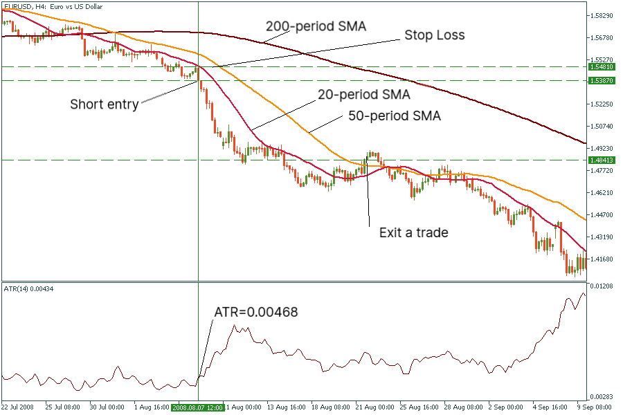
Most trend traders prefer building trend-following systems rather than using raw price charts. These complex setups include implementing technical indicators to the chart. There are several trend following indicators that can help you with that. The most popular are moving averages. There are various types of moving averages: simple, exponential, linear weighted, and smoothed. Each one has a different mathematical function behind it.
Simple moving average (MA) is the most popular type of moving average. It shows the average prices for the considered period.
Exponential MA and linear weighted MA calculate the latest prices with the higher coefficient. They tend to provide faster signals. However, they may provide lagging information, be careful!
Smoothed MA is based on the simple MA. It clears price moves from fluctuations the most.
The best moving averages for identifying trends are simple and smoothed moving averages. A trader can set different periods of MAs for trend analysis. Typically, a trader sticks to the 200-period simple moving average, which shows the directional bias of the market.
A classic interpretation of the trend trading strategy with a 200-period simple moving average is straightforward. If the price is moving above the moving average, this indicates an upside momentum. In that case, you need to consider long entries. Vice versa, when the price goes below the 200-period SMA, you are most certainly facing a downtrend.
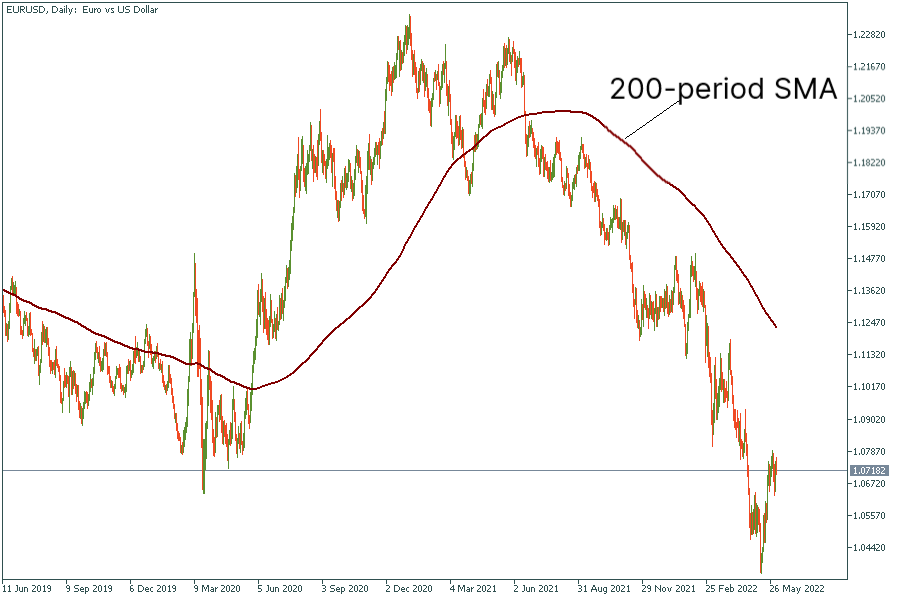
On the daily chart of EURUSD above, you can see that the price was forming higher highs and higher lows when it was above the moving average. Alternatively, it was making lower lows and lower peaks when it was below the moving average.
Trend intensity indicator
There is another indicator that can be a powerful helper when it comes to working with trends. The trend intensity index (TTI) developed by M. H. Pee to measure the strength of a trend in the market. It compares the proportion of prices for the previous 30 days above or below today’s 60-day moving average.
It bases its calculations on today’s 60-day MA and each day’s deviation. The deviations are calculated as the difference between the close price and the average. Upward deviations give a positive amount while the downside deviations give negative amounts. The formula for the TII indicator looks like this:
Trend intensity index (TII) = (total up / (total up + total down)) × 100
The trend intensity indicator balances between 0 and 100. If the TII value is below 50, the trend is bearish. When it moves near 20, the downtrend is strong. Conversely, if TII is above 50, the trend is bullish. The closer the indicator is to 80, the stronger the uptrend. You can download the trend intensity index for Metatrader 5 from the official MQL5 website.
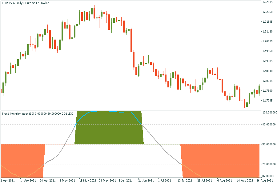
The chart above shows that when the price was heading upwards, the indicator was above 80. When the price was making lows, the TII indicator fell below 20. We might also notice that despite its seeming accuracy, the trend intensity index is a lagging indicator. You can see that by looking at the right border of the green rectangle: the price reversed to the downside, but the indicator still shows a strong uptrend. Therefore, you can use it as an additional tool to spot a trend, but not as a signal provider.
Trendlines and chart patterns
Chart patterns play an important role in technical analysis and trend trading. If a trend trader has experience working with chart patterns, it will help them predict a reversal or a continuation of a trend. Some traders build the entire trend trading system rules on chart patterns. Let’s look at the most popular ones.
Head and shoulders pattern
The head and shoulders pattern is usually formed at the end of an uptrend. It consists of a head (the second and the highest peak), two shoulders (lower highs), and a neckline that connects the lowest points of the pattern and acts as a support level. The neckline may be either horizontal or sloping up/down. If the price breaks below the neckline after forming the second shoulder, the pattern is confirmed, and you can see the beginning of a downtrend. The pattern helps trend traders exit their long entries and prepare for a new downward movement.
Alternatively, there is an inverse head and shoulders pattern, which appears at the end of a downtrend and signals the beginning of an uptrend.
Double top and double bottom
The double top pattern consists of two consecutive peaks of similar height with a small distance between them. This pattern signals that the trend will change from ascending to descending. As with the head and shoulders, you can draw a neckline through the lowest points of this pattern.
There is also a double bottom pattern, which predicts a potential reversal to the upside.
Continuation chart patterns
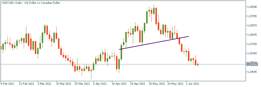
A trader who wants to confirm a strong trend will find continuation chart patterns extremely useful. There are triangles, flags, pennants, wedges, and rectangles. Triangles and flags are the easiest to spot.
Triangle
There are three types of triangle patterns: ascending, descending, and symmetrical.
If you face an ascending pattern, the uptrend will likely continue.
In case of a descending pattern, you need to prepare for a downtrend.
In the case of a symmetrical triangle, neither bulls nor bears dominate the market.
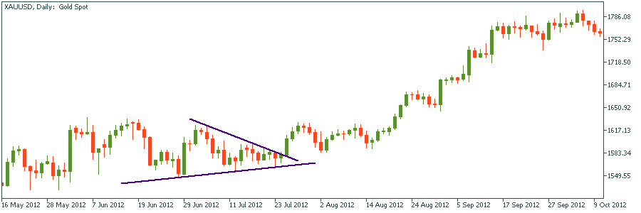
Symmetrical
In the picture above, you can see an example of a symmetrical triangle pattern. If you place entry orders above the lower highs and below the higher lows, you will catch the right one. Don’t forget to cancel the alternative order when one of them is hit.
Flag
The flag pattern is formed when a consolidation phase follows a substantial price movement. It consists of two parallel lines and a flagpole. A bullish flag appears during the uptrend (see the picture below). Vice versa, a bearish flag signals the continuation of a downtrend.
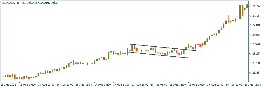
As you can see on the picture above, the bullish flag is an ideal confirmation of further bullish momentum. If it appears on the chart, you need to hold your long position.